GERMAN SCHOOLBOY POSES WITH GIANT PRETZEL : FIRST DAY OF SCHOOL : RPPC 1928

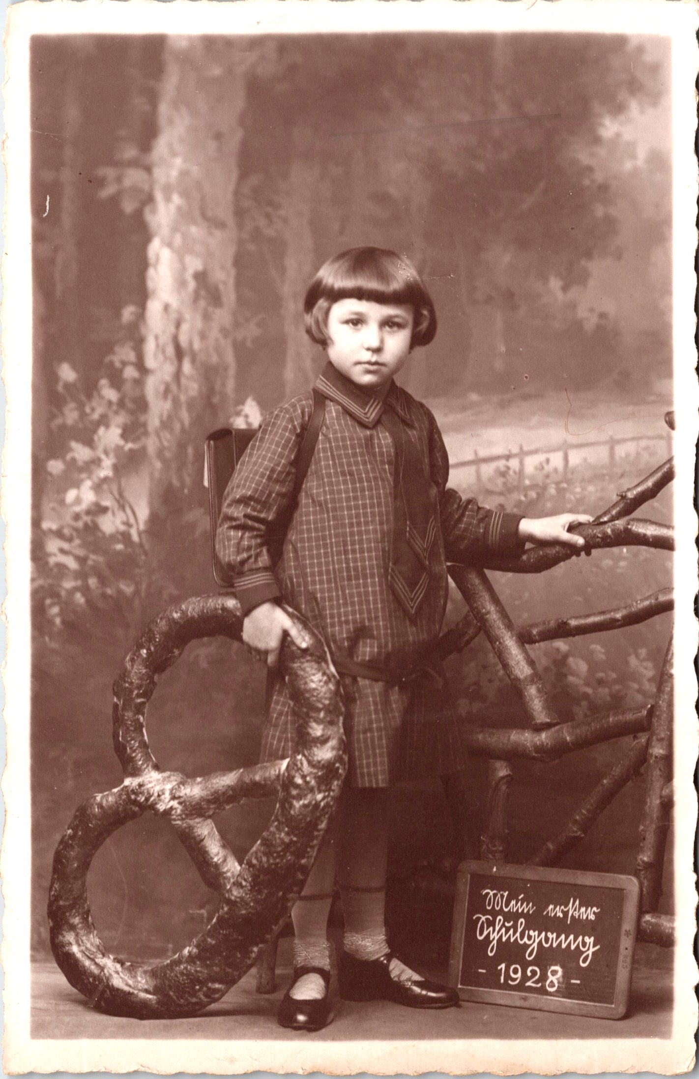
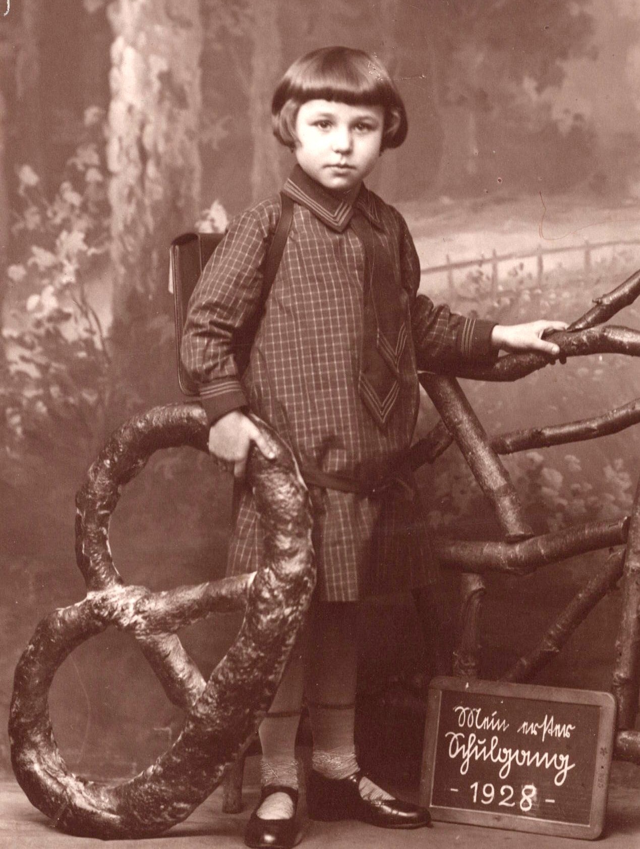
This evocative scalloped edge vintage real photo postcard captures a young school-aged child posed formally in a studio setting, dated 1928, during the late Weimar Republic period in Germany. The child stands confidently beside a sculptural studio prop resembling intertwined branches, resting one hand upon it while wearing a traditional school outfit of the era. Slung over the shoulders is a rigid school satchel (Schultasche), a detail that firmly anchors this image in everyday German childhood life of the 1920s. Most striking is the oversized pretzel-shaped prop placed prominently in the foreground. Far more than a whimsical accessory, the pretzel is a long-standing symbol in German culture, often associated with good fortune, nourishment, and childhood traditions. Its exaggerated size suggests a playful studio device meant to charm parents and relatives, blending symbolism with visual appeal.The painted studio backdrop—featuring a tree trunk and rustic fencing—adds a pastoral, storybook quality, contrasting gently with the child’s serious, composed expression. This blend of innocence and formality is characteristic of early 20th-century European studio portraiture. The sign beside the child translates as : “My First Day of School – 1928”. This inscription confirms the occasion and elevates the postcard from a simple portrait to a commemorative milestone image. Postcards like this were often produced to mark important life events—first school day, confirmations, or birthdays—and were commonly sent to extended family members. The clean, unused reverse suggests this example was preserved as a keepsake rather than mailed. The overall condition of this postcard is very good. The card has light, even age toning consistent with period silver gelatin postcards. There is minor surface wear at it’s corners. There are no creases. The image remains sharp with excellent contrast. Please review scans carefully for full condition details.

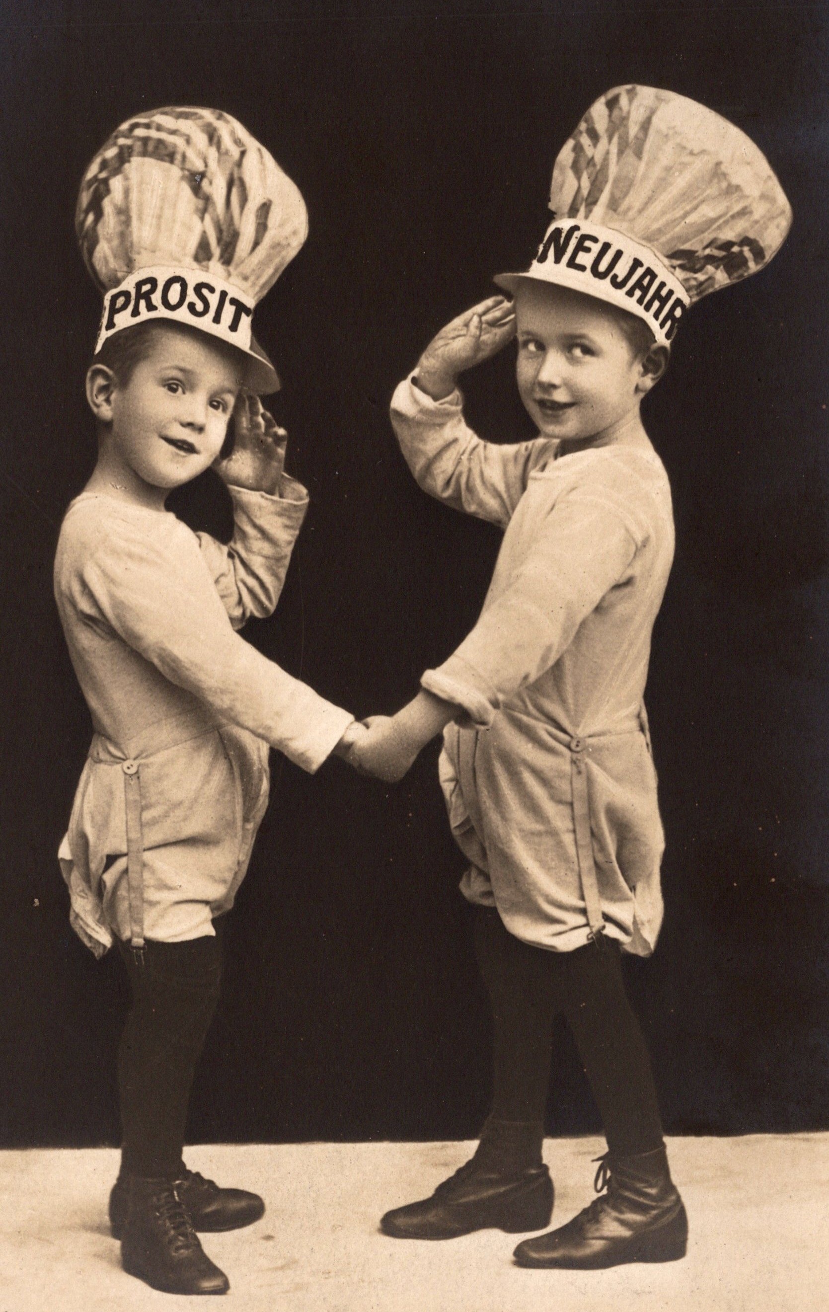
This cabinet card is available for purchase at The History Peddler for $36.00 at auction

Interested collectors may view the listing here:

https://www.ebay.com/itm/236546499067

EASTER GREETINGS : CHILDREN IN CHICK COSTUMES PUSHING EGG CART : C. 1908

This embossed charming and slightly surreal early Easter greeting postcard dates to the pre–World War I era (circa 1907–1912), a golden age for richly illustrated holiday cards. The scene shows two children dressed as fluffy yellow chicks, with one clinging to a large red Easter egg mounted on a small wheeled cart, while the second child strenuously pulls the cart forward. The imagery blends childhood whimsy with springtime symbolism—rebirth, fertility, and renewal—hallmarks of Edwardian Easter iconography. The artist leans into playful fantasy: the children’s chick costumes blur the line between human and hatchling, a visual trope that was extremely popular in Easter cards of this period. The textured, patterned background and soft pastel palette are typical of high-quality chromolithographic printing. The front of the card bears the greeting “Easter Greetings” in decorative script. There is no captioned joke or verse—this is a pure visual fantasy card, designed to charm rather than instruct. Cards like this were often sent to children or between close family members, especially grandparents to grandchildren. Although no publisher imprint is visible on the front, the illustration style, printing quality, and subject matter are strongly consistent with German-produced holiday cards, which dominated the American Easter postcard market before WWI. German printers excelled at embossed chromolithography and frequently exported cards for U.S. distribution. In regard to condition, the card’s colors remain strong and well saturated. There is light corner and edge wear consistent with age. The embossing remains crisp and well-defined and there are no creases or tears. No major creases or tears. Overall, this postcard is in good vintage condition for a holiday card of this age. It appears to have been produced in the 1910’s.  

This vintage postcard is available for purchase at The History Peddler for $14.00

Interested collectors may view the listing here:

https://www.ebay.com/itm/236541491118

Published in: on January 3, 2026 at 12:00 pm  Leave a Comment  
Tags: , ,

NORMA WHALLEY : PRETTY STAGE & FILM ACTRESS : JOHNSTON & HOFFMAN : UNCOMMON RPPC

The pretty actress seen on this vintage real photo postcard is Norma Whalley (?-1954). She was an Australian stage and film actress performing in the United States and Great Britain. Whalley toured South Africa during the late 1890’s. She married J. Sherrie Matthews in 1901. He was an American Vaudeville performer. In 1902, a stroke left him permanently disabled. She divorced him in 1904 and married barrister Sir Percival Clarke. Whalley came to the US to perform on the stage with George Edwardes company. She worked in Chicago and New York for several years from the late 1890’s. She performed on Broadway in “The Man in the Moon” (1899). Whalley also had a film career. The IMDb credits her with 21 films between 1920 and 1935. This postcard was published by Aristophot as part of a series (No.E92). 
Aristophot was known for publishing “made in Germany” real photo postcards. They operated from Germany (Saxony) and New York and produced high quality postcards. The firm’s focuses included capturing images of stage and film starsWhalley was photographed for this portrait by the Johnston & Hoffman studio. The postcard is in good condition (see scans). There is minor corner and surface wear. (See Scans). Postcards featuring Miss Whalley are not difficult to find, however, this particular postcard portrait of the actress is uncommon.

This cabinet card is available for purchase at my store, The History Peddler, for $22.00 or best offer.

Interested collectors may view the listing here:

https://www.ebay.com/itm/336367805879

SMILING COUPLE POSE IN A FAUX GARDEN: WHY IS THIS WOMAN HOLDING A WHIP? (RPPC)

This vintage real photo postcard (RPPC) features a smiling couple posing in a photographic studio’s faux garden.  Note the leaves affixed to the wall behind them. This couple seems very happy together but they apparently didn’t maintain their marital harmony because they ultimately got divorced. One hopes that the whip that the woman is holding had nothing to do with their marital discord. The woman’s name in this photograph is Grace McBurney. Her name is written on the reverse of the postcard, undoubtedly by one of her relatives. Research reveals that Grace R. McBurney (1893-1969) was born in Oregon and married at the age of 19 to William H. McBurney who worked as a “typewriter representative”, which I assume means he sold typewriters. The couple had at least five children: Virginia D.(born around 1914), Marguerite F. (1919-1999), Wilma (born around 1920), William (1923-1981), and Carl Morton (1928-2007). Perusal of US census data reveals that the couple were divorced sometime between 1930 and 1940. It appears that Grace lived her entire adult life in Portland, Oregon. She is buried in Lincoln Memorial Park in Portland. Preliminary research yielded little information about her husband. This photo postcard was produced by the Mazrograph Studio in Portland. Mazrograph was the process Calvert used to produce the photo postcards quickly. The studio’s stamp can be seen on the reverse of the postcard. The stamp also mentions that the photo production process took only ten minutes.The postcard paper was produced by Cyko sometime between 1906 and 1915. Charles E. (Cal) Calvert operated his studio at Sixth and Ankeny from 1906 through 1930. In 1907, with the opening of Council Crest Amusement Park, he operated a studio and postcard stand on it’s grounds. He also ran a studio at the Washington Street entrance to Portland’s City Park in 1910. Cal was known for his use of rustic props and for his creativity. One of his sets involved subjects appearing as if they were flying an airplane over the city of Portland. A postcard employing this setting is part of a collection at the Portland Art Museum. This RPPC was taken in a “10 Minute Photo Gallery”. The reverse of the card advertises “Cal Calvert, Postcard Man”.  As a side note, there was also a Calvert’s Studio across from Oregon City’s Southern Pacific Depot but it was run by Harry Calvert and his wife Alvilda. Harry was not related to Cal Calvert. Harry’s studio operated from 1915 through 1925. This vintage real photo postcard is in very good condition (see scans).

This cabinet card is available for purchase at my store, The History Peddler, for $22.00 or best offer.

Interested collectors may view the listing here:

https://www.ebay.com/itm/336044527284

CUTE KIDS IN CHEF HATS : HAPPY NEW YEARS : ROTOPHOT : REAL PHOTO POSTCARD

A wonderfully playful German New Year “Prosit Neujahr” real photo postcard published by RPH (Rotophot), Berlin—a major early 1900s European postcard producer best known for high-quality photographic subjects and big, numbered series.  The image is pure studio charm: two children in oversized chef-style caps (party hats styled like tall cooks’ toques), posed hand-in-hand as if about to dance into the New Year. One cap reads “PROSIT” (a festive toast—“cheers!”) and the other reads “NEUJAHR” (“New Year”). Their little salute gestures and the crisp studio lighting give this card that classic pre-war holiday-photo look. At the lower left you’ll find the RPH monogram in a circle and the printed series number S.1281/3, identifying this as a Rotophot issue. Overall, this postcard presents nicely with minor edge/corner wear (see scans). The card was mailed to someone in in Laubach, Germany. The postcard has a green 5 (phennig) stamp from Germany. The message is difficult to clearly decipher but it is clear that it is a traditional New Year greeting. It appears to read “Heartfelt New Year’s greetings and a happy New Year …”. This card is likely from sometime around 1905 to 1907.

This cabinet card is available for purchase at my store, The History Peddler, for $22.00 or best offer.

Interested collectors may view the listing here:

https://www.ebay.com/itm/336367805881

Published in: on December 31, 2025 at 12:00 pm  Leave a Comment  
Tags: , ,

SIKH SOLDIERS BRITISH INDIAN ARMY : BASTILLE DAY : PARIS : POSTCARD : WW I 1916

This striking World War I–era postcard captures a powerful and historically important moment: Indian Sikh soldiers marching through Paris on July 14, 1916, France’s Bastille Day. The scene shows a column of turbaned Sikh troops advancing down a Parisian boulevard, sabers drawn, while a French woman steps forward to present flowers—an evocative gesture of gratitude and solidarity from the French public toward Allied colonial troops. The men are Sikh soldiers serving in the British Indian Army, identifiable by their turbans, beards, and traditional curved sabers (talwars), worn alongside British military uniforms and equipment. Sikh regiments were highly respected for their discipline and battlefield effectiveness, and tens of thousands served on the Western Front during the First World War. Many fought in France and Belgium between 1914 and 1918, sustaining heavy casualties far from home. This particular image documents their ceremonial participation in a Paris victory parade, rather than a battlefield scene. By 1916, Sikh and other Indian troops had become a familiar—and deeply symbolic—presence in France, representing the global reach of the Allied war effort. Public parades such as this one were meant to boost morale and emphasize unity among the Allies. The interaction in the foreground—flowers being handed to a senior Sikh soldier—adds a human and emotional layer to the photograph, underscoring the respect these men received from civilians who understood the sacrifices being made on their behalf. The caption under this postcard’s image can be translated as “July 14 in Paris, 1916 – The Indian Sepoys”. The term cipayes (sepoys) was commonly used in French to describe Indian soldiers serving under British command. The small monogram “ELD” at the bottom left of this postcard, is the publisher’s photographic logo and corresponds to Éditions Le Deley, a major Parisian postcard publisher active in the early 20th century. Le Deley was especially known for producing high-quality photographic postcards documenting current events, military subjects, and international themes during World War I. The reverse confirms the publisher as Le Deley, with a Paris address printed along the left edge. Le Deley issued thousands of wartime postcards and played an important role in visually documenting France’s experience during the Great War, including its colonial and Allied forces. This vintage postcard is in good condition. It presents well, with strong image clarity for its age (see scans).

This cabinet card is available for purchase at my store, The History Peddler, for $28.00 or best offer

Interested collectors may view the listing here:

https://www.ebay.com/itm/336365174217

PORTRAIT OF THE THE FOUR COOLEST BOYS IN TACOMA, WASHINGTON

four guys

The boys were out on the town and decided to go to Mr Lindahl’s studio on Tacoma Avenue to have their portrait taken. They were very close friends and wanted to have a record of their comradery. Maybe that is exactly how these four boys ended up in the photographers studio the day that this image was taken. The young men in this picture look like they knew how to have fun. In fact, they seem to have enjoyed posing for their photograph. The boys are well dressed and exude an air of excitement and mischievousness. The photographer’s imprint,  appears cleanly at the bottom of the mount. John Conrad Lindahl was active in Tacoma between 1892 and 1906. This photograph is mounted on a dark studio card with a thin decorative border framing the image. The tones remain rich, with good contrast and clarity in facial features and clothing details. The photograph has light edge and corner wear. The back of the photo shows toning and handling wear, with a small old handwritten price notation. There are no creases or cracks present. Overall, this vintage photograph is in very good antique condition (see scans). The photograph measures about 5″ x 7″.

This cabinet card is available for purchase at The History Peddler for $35.00 or best offer.

Interested collectors may view the listing here:

https://www.ebay.com/itm/236555964597

Published in: on December 29, 2025 at 12:00 pm  Leave a Comment  
Tags: , , ,

1899 TEMPERANCE BIBLE CARD : WOES OF INTEMPERANCE : PROVIDENCE LITHOGRAPH CO.

This original illustrated card dates to 1899 and was issued as part of the religious educational series “Bible Pictures for Our Little Ones,” published by the United Brethren Publishing House of Dayton, Ohio. The front features a vivid chromolithograph illustration titled “Woes of Intemperance,” copyrighted in 1899 by the Providence Lithograph Company, a major American lithographic firm known for high-quality color printing in the late 19th century. The scene depicts two well-dressed boys in a domestic interior, standing beside a sideboard laden with glassware and wine. One boy reaches toward a glass of wine, while the other gently restrains him, attempting to lead him away. The image is deliberately moralistic, visually reinforcing the biblical warning against alcohol consumption. Beneath the illustration appears the scripture citation Proverbs 23:29–35, followed by the admonition: “Wine is a mocker, strong drink is raging: and whosoever is deceived thereby is not wise.” The reverse contains a didactic lesson sheet, clearly dated Fourth Quarter—November 26, 1899, and intended for use in Sunday schools or home religious instruction. It explains the image in simple language, emphasizing temperance and obedience to scripture, and concludes with a series of question-and-answer prompts designed for children, reinforcing the moral lesson that pure water is the best drink. Items like this were meant to be both instructional and collectible, and they reflect the strong influence of the 19th-century temperance movement, which intertwined religious education with social reform. Survival rates are relatively low, as these cards were often handled by children and discarded after use. (SOLD)

PRETTY WOMAN TAKING A BATH : RISQUE : PROVOCATIVE : FRENCH RPPC : c1910

This vintage French photographic postcard presents a playful and deliberately risqué studio scene, produced in France during the early 20th century, likely circa 1905–1915. The image shows a young woman reclining nude in an ornate bathtub, leaning over the tub’s edge with her arms folded and smiling directly at the viewer. Her expression is open, flirtatious, and self-aware, clearly intended to engage the recipient in a lighthearted, teasing manner. The setting is a stylized interior, with a patterned background and a decorative porcelain bathtub, lending the scene an air of theatrical elegance rather than explicit exhibition. While the subject is unclothed, the composition remains suggestive rather than explicit, placing the postcard squarely within the tradition of French “risqué” or “galant” postcards that were popular in the Belle Époque period. The card is marked “REX 811” on the image side, identifying it as part of a commercial French postcard series, produced for novelty and adult amusement rather than private photography. Such cards were widely collected, mailed discreetly, or kept in albums, and today they are sought after for their blend of early photography, social history, and erotic ephemera. A translation of the message is as follows: “Peek-a-boo… it’s me!” “Yes, it really is me… in flesh and bone, In flesh above all — but behind closed doors…” The wording is intentionally playful and suggestive, reinforcing the private, teasing tone of the image and making the postcard unmistakably risqué by period standards. The postcard is in very good vintage condition. There is light edge and corner wear consistent with age. The image remains clear, with good contrast and no major distractions. The reverse shows light handling wear (see scans).

This vintage postcard is available for purchase at The History Peddler for $38 or best offer

Interested collectors may view the listing here:

https://www.ebay.com/itm/236552618037

Published in: on December 27, 2025 at 12:00 pm  Comments (3)  
Tags: , , , , ,

GERTRUDE QUINLAN AS ANNETTE IN “KING DODO” : STAGE ACTRESS : CHICAGO : 1906

This scarce and evocative antique theatrical portrait photograph, measures 5 x 7 inches, and depicts actress Gertrude Quinlan in her role as Annette from the musical comedy King Dodo, as performed at Daly’s Theatre in Chicago, Illinois. The photograph was taken by the Gibson Art Galleries of Chicago, a prominent studio known for producing high-quality portraits of stage performers and society sitters in the late 19th and early 20th centuries. In this portrait, Quinlan is presented in a softly lit, pictorialist style, wearing a flowing costume and an elaborate floral headpiece that frames her face. Her pose—head gently inclined, hand raised thoughtfully toward her chin—reflects the refined, expressive aesthetic favored in Edwardian theatrical portraiture, designed to emphasize character, mood, and feminine grace rather than strict realism. The image would have served both as a promotional likeness and as a collectible souvenir for theatergoers. Gertrude Quinlan was an early 20th-century American stage actress active during the height of musical comedy and light operetta in the United States. She sang in over 125 operas. While not a headlining star of the era, she was part of the important working class of professional actresses who sustained touring companies and long theatrical runs in major cities such as Chicago. Performers like Quinlan frequently appeared in chorus and featured roles, and their images were commonly commissioned by studios like Gibson Art Galleries for publicity and personal distribution. Her appearance as Annette in King Dodo places her squarely within the lively theatrical culture of Chicago in the first decade of the 1900s, when the city rivaled New York as a major center for touring Broadway and London productions. King Dodo is a musical comedy that originated in London in 1906, produced by George Edwardes, with music by Walter Slaughter and a libretto by Harry B. Smith. The show was quickly brought to the United States, where it enjoyed considerable success on tour. The production appeared in Chicago at Daly’s Theatre during the 1906–1907 season, part of the American run that followed its London popularity. King Dodo is a lighthearted romantic farce centered on a fictional European kingdom where a young king—nicknamed “King Dodo” due to his naïveté—navigates court intrigue, romantic entanglements, and mistaken identities. The character Annette is typically portrayed as a charming and sympathetic young woman whose relationships and choices help drive the comedic and romantic elements of the story. Like many Edwardian musical comedies, the play emphasized humor, romance, and spectacle over realism. This vintage photograph is in good antique condition. The photo has edge and corner wear, mild surface toning, and handling marks consistent with age. Note the surface issue on the mount near the top right corner. The image itself remains strong, with pleasing tonal range and soft focus characteristic of early 20th-century theatrical portraiture (see scans). ADDENDUM: A fellow collector offers a correction to my item description. The helpful individual asserts that  “King Dodo” was an American operetta by the team of Pixley and Luders, premiering in 1902.”

This cabinet card is available for purchase at my store, The History Peddler, for $45.00 or best offer.

Interested collectors may view the listing here:

https://www.ebay.com/itm/236552620239

Published in: on December 26, 2025 at 12:00 pm  Leave a Comment  
Tags: , , , ,